enrollment
Comparing price sensitivity and wealth at private colleges: How does your campus stack up against the rest?
I recently attended a summer youth convention and observed how much each person was interested in being “normal.” While individuality was valued, most of the youth dressed in a similar style to their peers. In many ways, colleges and universities are also peer-oriented; they want to know if they are “normal” in terms of first-to-second-year retention rates, yield rates, discount rate, standardized test scores, and a slew of other data points. Every institution wants to know, “How do we compare to like institutions?”
In the areas of price sensitivity and wealth, the comparisons are especially intriguing to me. I have long been interested in exploring:
- How does the average wealth of a school’s student population relate to the average tuition and fees that are being charged?
- How does this “wealth index” relate to how efficient these schools are in the distribution of institutional aid?
- How do the above factors relate to outcomes indicators like yield and discount rates?
The idea of a “wealth index” comes from Dan Nelson of Bethel University (MN), who has surveyed members of the Council for Christian Colleges & Universities to plot each institution’s average total cost against the average wealth of a student at that school. Like Dan, Noel-Levitz measures wealth by measuring dependent, full-time, first-time traditional students’ Estimated Family Contribution (EFC) from the FAFSA. For non-FAFSA filers, we estimate wealth as equal to the total cost of attendance. Total cost is a measure of tuition, fees, and room and board (for residential students). Unlike Dan, we omit international students.
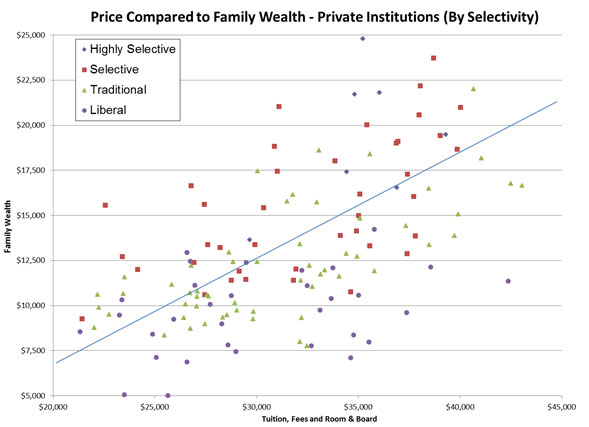
The following chart provides a starting point for answering the above questions. In working with more than 150 private colleges and universities across the United States in the financial aid area, Noel-Levitz has a good data set which allows us to categorize and compare colleges and universities on two of these metrics using ACT’s four selectivity categories:

The line of “best fit” shown here allows you to compare your institution to the institutions plotted on this graph that have similar costs, student wealth levels, and selectivity. Schools plotted above the trend line have more wealth than average given their cost. Schools plotted below the line have less wealth than average given their cost. Institutions that are well below the line have a much needier population compared to what is being charged, increasing the importance of efficiently allocating aid. Conversely, students at institutions above the line may be both more willing and able to pay for the stated charges, allowing institutions more flexibility to shape the student body. Schools that are already wealthy have the flexibility of being able to think more creatively about how they wish to spend their institutional financial aid resources while those below the line are simply trying to enroll the next class at a certain level of net revenue so they don’t have to lay off faculty and staff.
Upon further analysis of the data, there is a high correlation between a school’s average student wealth, average ACT score, and first-to-second-year retention. When we segment schools by the four selectivity categories from ACT, striking trends about institutions are evident above and below the line. Schools categorized as “highly selective” appear exclusively at or above the trend line. “Selective” schools appear above the line 60 percent of the time, while only a third of “traditional” and 20 percent of “liberal” schools appear above the line. As such, schools in the lower two selectivity tiers need to distribute their limited institutional resources as efficiently and effectively as possible in order to meet their enrollment and net revenue goals. Schools above the trend line may be tempted to breathe a sigh of relief, but they too have limited institutional financial aid dollars. These schools above the line need to use their dollars in a way that best meets all institutional goals, such as expanding diversity or improving academic quality.
In addition to this analysis, I will have two upcoming blog posts that further dig into this data set. The first will explore the efficient distribution of aid. The second will look at yield rates, retention rates, net revenue, and average-need-met-with-gift-aid in relation to wealth and the efficient distribution of aid.
If you have any questions, please feel free to leave a comment or e-mail me.
