enrollment
Information architecture for college websites: Getting student web visitors on the path to enrollment
If you have worked in higher education for any amount of time, you’re familiar with the difficulty of navigating campus—whether it be due to poor wayfinding or less than ideal processes that send students from office to office to complete a simple task like getting registered—what is referred to as “campus runaround”
There’s another common occurrence of runaround that can turn off prospective students from enrolling: campus website runaround, where students zip from page to page trying to find the information they need as they consider your school.
This online runaround is often the result of poor information architecture. Information architecture is one of the most foundational and many times overlooked tools to steer prospects to your desired end locations. Information architecture may seem tedious and repetitive (especially in higher education were campus sites can be very large), but it plays a crucial role in the perception of a campus website. And for many students and parents, their perception of your website can affect their perception of your institution.
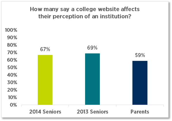
Those perceptions, plus knowing that information architecture is a stepping stone to a multitude of desired outcomes on your website, should highlight its importance.
Look familiar? Sure it does
![]() 73% of sites surveyed use some variation on the term ‘Academic’ as the gateway to program information. 68% of sites provide access to admission related information through a navigational item with the word ‘Admission’ in it. Source: 2013 eduStyle Navigation Trends in Higher Ed Report
73% of sites surveyed use some variation on the term ‘Academic’ as the gateway to program information. 68% of sites provide access to admission related information through a navigational item with the word ‘Admission’ in it. Source: 2013 eduStyle Navigation Trends in Higher Ed Report
Moving beyond navigation to strategic information architecture for enrollment
For starters, let’s arrive at an understanding of what information architecture (IA) is. No, it is not simply the navigation or a page design. Information architecture includes the hierarchy of individual page elements; it provides blueprints for the design interface and a path so users can easily achieve their desired outcome. At a very basic level, information architecture informs what elements should be placed on a site and where those elements should reside. Your goal is to balance the needs and outcomes of users and the reflection of your brand, and drive users to where you want them.
So how do you use information architecture to expedite the enrollment process?
For now, let’s dig into two key elements of IA: sitemap and page architecture.
Sitemap for Example University: Creating multiple information paths that satisfy the web visitor
The sitemap shows every page on your site and their relationship to each other. There are a number of factors to keep your site architecture enrollment focused.
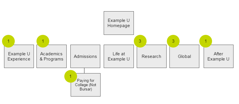
- Identify the audience and organize for those users (their language, their terms, their needs)
- Use the right nomenclature
- Help the students identify if your campus is a good fit
- Show them outcomes
- Guide their movement through the information discovery process (and the pages that will address these information needs in order of need and based on your analytics data)
- Will they fit? (Example U Experience page)
- Do you have the program they want? (Academics & Programs)
- How do they get in? (Admissions)
- What is campus life like? (Life at Example U)
- Support brand identity and differentiators
- Is your school global? (Is this a brand attribute?)
- What are you best known for—research, global impact, location, etc.? (Is this how you position you school?)
Wire frame (page schematics): Creating an information path at the page level that engages the reader
Once the visitor arrives on a page, information architecture then guides the wire frame, or the schematic of that page: how information is ordered, what’s called out, headlines, images, calls to action, and other key elements.
Consider this example of a program page. The numbers below highlight key elements.
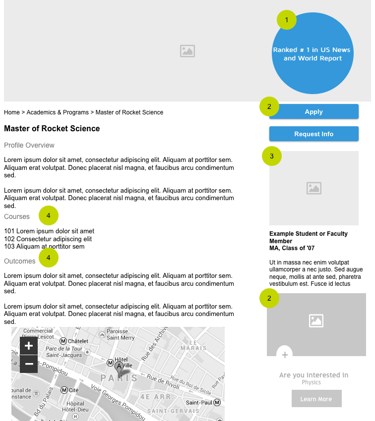
- Relevant page elements:
- What is your value proposition?
- Obvious calls to action for key tasks:
- Every page should have a goal—always give students the ability to take action.
- Supportive tertiary content such as facts, promos, blog posts, profiles, videos, etc. that support the particular page the user is on. For example:
- Grad students like to learn about their future faculty.
- Student like to visualize their future self.
- Provide content that answers key questions:
- What will I study?
- Are there scholarships?
- Where might I study next or where might a get a job?
Just remember that these decisions are all informed by various forms of research. The best campus websites use research and data to inform information architecture and guide prospective students through a seamless and satisfying experience that makes it easy for them to research your campus and connect with you.
Want to learn more about the keys to information architecture?
Listen to the recording from our webinar, Optimizing College Website Information Architecture for E-Recruitment, which digs deeper into IA research methods, process, and deliverables to ensure your information architecture get users on the right path and gets you the best outcomes. Or please email me if you have any questions or would like to have a conversation about structuring your site or web pages.